Last week I spent an afternoon working on some upcoming designs.
The image Pastor sent to me is from here. Someone used it for a nice looking book cover for a family worship topic. After doing the small format designs, I realized that there was no way that tiny image was going to work for the 20x30 poster we need in the ministry center, so I started pulling pieces to put together something that would work in the larger print format.
Here's the original that Pastor sent to me - nice huh? It looked blown out but after some quick level adjustments I had a base to work with.
This is the final edited version for the HD Slides and another for the 20x30 poster:
Probably could use some more shadow for the hymnal that goes onto the Bible, but I think it's effective enough to pass muster.
Wood grain texture that I tiled and color corrected for the replaced table top is here and then the great scratches for the overlay for a more realistic table is here.
Here's the cup/saucer replacement.
Here is inspiration for the text layout.
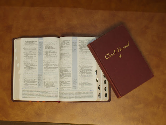
I took a photo of the Bible and hymnal - see that below - you should've seen me climbing onto the desk so I could get an aerial view. For the cup and the book replacements, I had to cut them from their backgrounds, color correct and then add realistic shadows. Did some coloring tomfoolery with the chairs and such cause I wanted a layout that was more blue than red since I ended up only being able to find a red hymnal.
Talk about fun! It took a long time, but the end result was worth it.


Comments
Post a Comment
Thanks for stopping by and for commenting. Now I know I am not alone in this great big world.