I'm the kind of designer, and I guess, the kind of person who really wants things to be the absolute best they can be - to communicate strong ideas that people don't just walk by without seeing. Usually that's a great impulse, but it bit me this week. I've got a new boss and am still trying to figure out what he prefers design-wise for his sermon title images and such. I like him - he's already teaching me valuable life lessons. I've just gotta find the off switch for when I wanna do something that pushes the ideas he's presented me with.
This week's passage is Acts 3:1-10 - it's the story of the apostles healing a lame beggar at the gate. Pastor mentioned that his sermon would focus on the people who live at our gates, ones we meet and don't give much thought to, but who have needs we could meet. The title he chose followed the pattern of the previous messages in his Gospel Results sermon series: A Life of Service.
Here's a progression:
I ran with the "gate" idea and the "invisible people" concept. First thing that pops into my head is homeless/vagrant/hobos sleeping in doorways - they're like the beggar in the city that the apostle healed - overlooked people with great physical and spiritual needs. Over the course of three hours or so, I narrowed down images and options and ended up with this:
Dramatic - yes? Little bit on the fringe. Yep, but that's typically a good thing. The original image didn't have a clear face visible, so I added one from a different photo, expanded the scene enough to fit the format, put some filters on it, and was about to work more on styling the text but pulled up for a minute to send it to the new boss for approval before I did.
While I waited for a response, I started thinking about how this wasn't a message about how we should serve the homeless - And I began to think I had pushed the imagery that should've communicated "don't ignore your neighbors" into the realm of "don't ignore the plight of the vagrant."
Yeah - a homeless guy at a fence may not communicate what he wanted to, so I started looking for other solutions while I waited for his response and ended up with these:
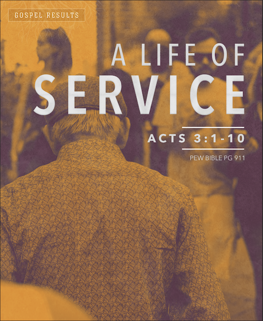
So, after looking at the above three options, he says, "Maybe the idea of Jesus washing feet could communicate service." And stubbornly I think - 'uh - the passage is about a lame guy getting healed, but um, ok.' [Where's that off switch?] He reiterates the idea about people being important, so I do one last ditch effort: a crowd scene with a lonely looking older guy in it that most of us would've overlooked.
After which I get a summons to his office where he's done a google image search and come up with something he thinks will work better. Bless him for putting up with my process. I'm laughing at myself for spending a lot of this day on this when I could've just waited for his response to the first image and then turned off my "what might work better" thoughts after he gave me an idea he believed would work. Why do I stubbornly do everything the hard way?
Anyhow, here's the final. Turned out ok - still not my favorite of all of them, but I think it works alright; however, I still think mixing stories visually (unless the message will include how Jesus serving the disciples by washing their feet relates to us serving strangers) is a fine, hairy little line that gives me hives. See, even now I can't turn that "what can I do to make this better" thought process - where's the off switch?!? LOL - I'm a mess.
Image of the basin and towels is a freebie photo from creationswap by Laura Merchant. I used some other previously purchased images for the texure and a night sky image from unsplash the glowing bits.


Comments
Post a Comment
Thanks for stopping by and for commenting. Now I know I am not alone in this great big world.