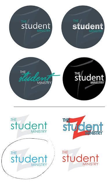
Ok - so we just finalized the logo for the rebranded student ministry here. We nixed the old name (so no more "Crossover" Student Ministries) and are opting for the simplicity of what people already call it: "The Student Ministry" - I know, not particularly clever but it works and I think it's fine.
Didn't sketch much for the design of this one. It's a spin on the main church Z-mark we created at the beginning of this year.
Below is the progression and the finalized versions. Took a little while to choose a font then we were off to the races. The colors are going to be in flux as the plan is to simply adapt it to its surroundings each time it's used. Also, when we do shirts we're going to try to focus on keeping the high school's colors in the design so the kids can wear them on spirit day.
Final one is circled. Started off with the round versions and ended up going with out the circle.
 |
| And here's the first layout using the new logo. A Thank you postcard. |

Comments
Post a Comment
Thanks for stopping by and for commenting. Now I know I am not alone in this great big world.