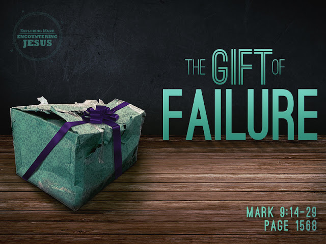
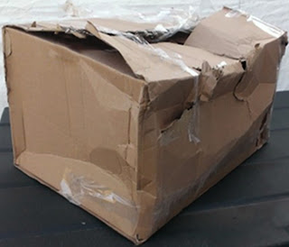
This week's sermon title slide was a lot of fun to put together. Pulled images from several places to make the box work and then I pulled images to create the environment for the box before working on the text and such. Will probably work on the text layout a bit more - am not fully satisfied with the font choice or layout just yet, but it's very close.
Started with this image and a title earlier this afternoon:
Ended with this:
 |
| This is the "almost" final rendering. Will be working a bit more on the text layout, but the background is pretty much done. |
Was fun to find the box, choose a pattern for the wrapping paper, warp that paper to fit. Most difficult part was deciding on the color scheme. The most fun was making the bow fit and putting the shadows on there in a believable manner. Not really satisfied with how the box doesn't quite seem grounded on the wood, but it's not so obvious that I am overly concerned about the believability. Just wish I could pin point exactly what is "wrong" about it so I might could fix it next time.


Comments
Post a Comment
Thanks for stopping by and for commenting. Now I know I am not alone in this great big world.