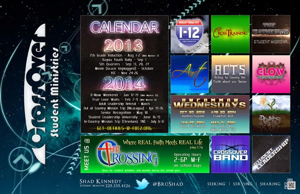
This year I've simplified the design for the student calendar a great deal - it's been a relief to focus on making cleaner looking designs - though that's not my first inclination. My first inclination has always been to "fill the space" leaving no room for the design to "breathe."
Anyway, in the new calendar design I've gone from upwards of 100 layers from last year's Windows 8 and iPad based design to just over 50 for this year's simplified one and that makes things much easier to move around and keep up with. Not to mention that I'm happier with the overall layout when I dump all of those logos in favor of text.
Speaking of dumping logos, I think the next thing that needs to be considered is simplifying/consolidating the logos around here - link everything (or almost everything) stylistically to the main logo. It's that age old House of Brands vs Brand House vs Mixed Brand House issue. I know that before I arrived various ministries didn't have the option of having their own logos - and there's very little direction as far as the brand is concerned, so everyone got their own logo. (I'm not sure I had the option of saying "no.") I think having so many logos have muddied the waters a great deal, and I hope that soon we will be able to simplify a lot of the designs, or in the very least, dial it back some. I'm about to begin working on a re-branding for the main logo, so now's the time to be saying something about all of this. I just hope I'll find some influential listening ears.
 |
| This is the old design for 2013-2014 |
 |
| These are some of the proofs of the simplified design. The one on the far right is the one we're refining, though I like the one on the far left. |
Comments
Post a Comment
Thanks for stopping by and for commenting. Now I know I am not alone in this great big world.